
TRON movie poster I created (Rough Draft)
Did you know that colour and visual elements activate the right brain (emotions), while the printed words activate the left brain (logic)? Colour and Typography remain to be the two most important elements in design. When you harmoniously combine them all you attract a quicker attentionx to the subject, reinforce impact and recognition, help in establishing powerful identities and brand, set a mood.
Today we’ll examine the DOs and DON’Ts in designing with colour, and next time we’ll investigate the topic of Typography.
Babies are colour-dominant: they are more attracted by colour than form. And even though we generally become more form-dominant as we mature, colour still plays an important role on how we perceive the message. For instance, why does red always call to attention? Whether you want to tweak the colours of your site, or design an ad or a poster to attract people to your products or services, or even paint the walls in your house, these colour essentials should help you in becoming more colour-wise.
DO take time to learn the colour wheel. All colours are
 made up of three primaries: red, blue and yellow. When you combine the primaries, you get the three secondary colours: orange, purple and green. When you combine each secondary colour with its neighboring primary, you get six tertiary colours: yellow-orange, yellow-green, blue-green, blue-purple, red-purple, red-orange. That’s how you get the familiar 12-colour wheel.
Every colour has a temperature: from the red/yellow side of the spectrum it’s warm, and from the blue/purple side it’s cool. It has anintensity that’s described as saturation or chroma. Saturation is determined by how much or how little grey a colour contains. High intensity colours are pure, bright and vivid. Less saturated colours are muted, soft and subdued. Every colour has a value, determined by its lightness or darkness. When planning a colour combination, value and saturation are as important as the hue (synonymous with colour).
DON’T miss on understanding the basic colour wheel rules:
I found this handy Flash application that visually explains the colour wheel in an easy to follow style. There’s also a helpful HP colour wheelthat showcases different colour schemes.
DO analyze the colour undertones.
 If you like blue but want a subtle effect, choose a white or grey with a blue undertone. A red-orange terracotta pot has a yellow tone to it, hence those colours will blend harmoniously with each other. On the other hand, don’t emphasize an undesired undertone by pairing it with its complement: if the shade of brown has a pink undertone to it, combining it with green (the complement of red) will only intensify the problem.
Learn to identify colour tone, its warmth or coolness. A warm blue contains some red that makes it to look more purple, while a cool blue contains some green, which makes it more aqua or teal.
Do keep in mind that neutrals also have undertones. Often people will mistake grey for blue if there’s a blue undertone, or plum if the undertone is violet.
DON’T neglect the fact that colours ‘change’ according to their surrounding:
 A large rectangle and a narrow line (or type) of the same colour will seem to have different values when placed against a white background: the colour in the line will look darker than it does in the rectangle, because it’s surrounded by much brighter white space.
 When two shades of the same colour, one dark and one light, are paired with each other, the darker shade will look darker and the lighter shade will appear to be lighter: a pink rose will seem to be paler against a purple background.
 Larger colour spaces will affect the smaller ones: if a small square of medium yellow is surrounded by a larger area of black, the yellow square will seem to be brighter than when surrounded by white. Any colour will appear lighter against a darker colour and vice versa.
 Outlining a colour in a darker shade will enhance the enclosed colour, helping to keep a colour from “spreading” into surrounding areas. On the other hand, a lighter outline will cause a colour to spread to adjacent colours, and reduce the strength of the enclosed colour.
This valuable tip comes from David Airey: There’s also the illusion how dark colours surrounding light ones will make the lighter area appear smaller than it is if it were the opposite (dark surrounded by light). It’s why you should always bump up the text size if you insist on using white text against a black background.
DO explore the colour psychology
While perceptions of color are rather subjective, and have different meanings in various cultures, some colours affect us in a similar way. The human eye sees warm colours before cool hues. Cool colours appear to recede, while warm colours appear to advance, however the degree of saturation can make a difference.
DON’T be afraid to experiment with colour combinations. Sometimes even the forbidden combinations work. Check out various online colour tools and applications that will help you to chose the right colour combination for your projects. Mac users can install numerous handy colour widget for the Dashboard: Adobe Kuler, Color Theory,ColorSchemer, ColorBurn.
UPDATE: I just found a great list of colour resources: Complete Color Matching Guide – it’s definitely worth to be bookmarked.
DO examine other sites and designs to determine which colour schemes are more appealing than others. In one of the upcoming weeks, I’ll be featuring sites that were designed with the excellent knowledge and sense of colour. Meanwhile, browse numerous CSS galleries, bookmark the sites with attractive colour schemes, thumb through the pages of various design magazines, books, not just the ones for graphic designers, but also architectural and interiour design publications, where you will be inspired by the innovative and fabulous colour combinations.
DON’T forget about the readability when combining
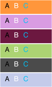 colour with type. It’s true that we mainly deal with the black type on white paper/page background, and that a black text on a light background is the easiest to read. However, it doesn’t mean that colour and type don’t mix. When used well, colour can add an emphasis to your message. Pay attention to the relative values and saturation of colours when a background colour interacts with coloured type. The contrast between type and background diminishes when their values move closer to each other, and the type becomes less legible. The contrast between the type colour and the background colour must be considerable to ensure that the type remains visible.
John from iLT also gives this valuable advice: “when using reversed out text (e.g. light on dark), it’s often advisable to make the text a little heavier, as the dark background tends to optically reduce the weight of the text.”
