Every had the Urge or need to impress someone around you! Check this App out. Did the design for this app. Feel free to let me know how I can improve this design:

Click Here to Download App
Every had the Urge or need to impress someone around you! Check this App out. Did the design for this app. Feel free to let me know how I can improve this design:
Click Here to Download App

Check out this website our team is redesigning and working on. Let us know what improvement you think are needed. http://www.mrpopularapp.com/
Hey everyone! It was an honor to work with an app development company in Silicon Valley. Here is one of the art pieces we created for this app. Let us know what you think—- Like it if you think its cool. Also, what do we need to improve.
Also, check out their new website. Super cool APP coming out July 2015. http://www.mrpopularapp.com/
Also: Be sure to Like them on Facebook so you can stay updated on the art pieces we create for them: https://www.facebook.com/pages/Mr-Popular-App/768042026575590?ref=bookmarks
Update: They are raising funds for advertising to make this app go viral. Be sure to support them if you like this App idea: https://www.kickstarter.com/projects/288646262/bring-mr-popular-app-to-life?ref=nav_search


Did you know that colour and visual elements activate the right brain (emotions), while the printed words activate the left brain (logic)? Colour and Typography remain to be the two most important elements in design. When you harmoniously combine them all you attract a quicker attentionx to the subject, reinforce impact and recognition, help in establishing powerful identities and brand, set a mood.
Today we’ll examine the DOs and DON’Ts in designing with colour, and next time we’ll investigate the topic of Typography.
Babies are colour-dominant: they are more attracted by colour than form. And even though we generally become more form-dominant as we mature, colour still plays an important role on how we perceive the message. For instance, why does red always call to attention? Whether you want to tweak the colours of your site, or design an ad or a poster to attract people to your products or services, or even paint the walls in your house, these colour essentials should help you in becoming more colour-wise.
DO take time to learn the colour wheel. All colours are
 made up of three primaries: red, blue and yellow. When you combine the primaries, you get the three secondary colours: orange, purple and green. When you combine each secondary colour with its neighboring primary, you get six tertiary colours: yellow-orange, yellow-green, blue-green, blue-purple, red-purple, red-orange. That’s how you get the familiar 12-colour wheel.
Every colour has a temperature: from the red/yellow side of the spectrum it’s warm, and from the blue/purple side it’s cool. It has anintensity that’s described as saturation or chroma. Saturation is determined by how much or how little grey a colour contains. High intensity colours are pure, bright and vivid. Less saturated colours are muted, soft and subdued. Every colour has a value, determined by its lightness or darkness. When planning a colour combination, value and saturation are as important as the hue (synonymous with colour).
DON’T miss on understanding the basic colour wheel rules:
I found this handy Flash application that visually explains the colour wheel in an easy to follow style. There’s also a helpful HP colour wheelthat showcases different colour schemes.
DO analyze the colour undertones.
 If you like blue but want a subtle effect, choose a white or grey with a blue undertone. A red-orange terracotta pot has a yellow tone to it, hence those colours will blend harmoniously with each other. On the other hand, don’t emphasize an undesired undertone by pairing it with its complement: if the shade of brown has a pink undertone to it, combining it with green (the complement of red) will only intensify the problem.
Learn to identify colour tone, its warmth or coolness. A warm blue contains some red that makes it to look more purple, while a cool blue contains some green, which makes it more aqua or teal.
Do keep in mind that neutrals also have undertones. Often people will mistake grey for blue if there’s a blue undertone, or plum if the undertone is violet.
DON’T neglect the fact that colours ‘change’ according to their surrounding:
 A large rectangle and a narrow line (or type) of the same colour will seem to have different values when placed against a white background: the colour in the line will look darker than it does in the rectangle, because it’s surrounded by much brighter white space.
 When two shades of the same colour, one dark and one light, are paired with each other, the darker shade will look darker and the lighter shade will appear to be lighter: a pink rose will seem to be paler against a purple background.
 Larger colour spaces will affect the smaller ones: if a small square of medium yellow is surrounded by a larger area of black, the yellow square will seem to be brighter than when surrounded by white. Any colour will appear lighter against a darker colour and vice versa.
 Outlining a colour in a darker shade will enhance the enclosed colour, helping to keep a colour from “spreading” into surrounding areas. On the other hand, a lighter outline will cause a colour to spread to adjacent colours, and reduce the strength of the enclosed colour.
This valuable tip comes from David Airey: There’s also the illusion how dark colours surrounding light ones will make the lighter area appear smaller than it is if it were the opposite (dark surrounded by light). It’s why you should always bump up the text size if you insist on using white text against a black background.
DO explore the colour psychology
While perceptions of color are rather subjective, and have different meanings in various cultures, some colours affect us in a similar way. The human eye sees warm colours before cool hues. Cool colours appear to recede, while warm colours appear to advance, however the degree of saturation can make a difference.
DON’T be afraid to experiment with colour combinations. Sometimes even the forbidden combinations work. Check out various online colour tools and applications that will help you to chose the right colour combination for your projects. Mac users can install numerous handy colour widget for the Dashboard: Adobe Kuler, Color Theory,ColorSchemer, ColorBurn.
UPDATE: I just found a great list of colour resources: Complete Color Matching Guide – it’s definitely worth to be bookmarked.
DO examine other sites and designs to determine which colour schemes are more appealing than others. In one of the upcoming weeks, I’ll be featuring sites that were designed with the excellent knowledge and sense of colour. Meanwhile, browse numerous CSS galleries, bookmark the sites with attractive colour schemes, thumb through the pages of various design magazines, books, not just the ones for graphic designers, but also architectural and interiour design publications, where you will be inspired by the innovative and fabulous colour combinations.
DON’T forget about the readability when combining
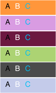 colour with type. It’s true that we mainly deal with the black type on white paper/page background, and that a black text on a light background is the easiest to read. However, it doesn’t mean that colour and type don’t mix. When used well, colour can add an emphasis to your message. Pay attention to the relative values and saturation of colours when a background colour interacts with coloured type. The contrast between type and background diminishes when their values move closer to each other, and the type becomes less legible. The contrast between the type colour and the background colour must be considerable to ensure that the type remains visible.
John from iLT also gives this valuable advice: “when using reversed out text (e.g. light on dark), it’s often advisable to make the text a little heavier, as the dark background tends to optically reduce the weight of the text.”
That’s right everyone just wants to be a Design Superstar? Oh really? No the fact of the matter is, when all else is equal, Superstars get hired, and boring designers don’t. The main difference between the two? The Superstar has the ability to sell his/her brand of design and if you want to be a hired designer, you should seriously consider doing the same.
Of all the professions out there, I think there is no other one that can benefit from “self-branding” as much as a design professional. That is because it is a profession that is almost solely driven by talent. The equation is very simple, in design it’s not about how many certifications or affiliations you have, but what gets you ahead is the quality of your portfolio as well as your plain raw talent.
Before we go on, you might like to take a look at the basics of “self-branding” or what Tom Peters calls “Brand you“. Smart guy that Tom, he has been talking about it since 1997. Briefly, in a world where the consumer product market is so saturated and most products are essentially the same, the only proven way to get ahead is by branding. Not only just about branding of products but a holistic 360 degree effort including everyone else in the process including the design agencies used to create such products.
Drawing similar branding parallels from the consumer product industry, we are our now well past the new millennium and into a knowledge economy driven by talent. Competition within the talents for the top job is very high, and logically the only way ahead is by the talent branding themselves in some way. You see the crux of the matter is, every single positive influence adds up to putting you ahead and a personal brand is one big factor.
Remember the design methods class you fell asleep in? Well its a pity, especially since no one told you that a SWOT analysis could and should be done on yourself. Just like a company and its ability to generate revenue, I encourage designers to see themselves as a “business entity” that can generate income as well.
Therefore you need to identify your own Strengths, Weaknesses, Opportunities (to apply your strengths) and Threats (to your weakness) as a designer. So that when faced with the question of what are your strengths, you should never have a problem. Finally it is always good to have a short, medium and long term plan for yourself and career. It shows prospective employers what you want to do and that you have a vision for your future.
After you have listed all these points, you now have a list of keywords that can be the bases of creating your own personal brand and brand values.
No seriously. I believe you are what you design. Many people get insulted when they are told they need to dress like a “designers” to be taken seriously. They figure that its a rude comment and encroaches in their personal style and space. That is further from the truth. Just like a consumer has only 3 seconds to size up a shelf of products, your prospective employer will size you up in that same amount of time.
In any case its pragmatic. Simply, that first impression is the most important. You will be surprise of the amount of control you have if you understood the stereotypes people associate with designers, and by looking like one you can use that to your advantage. Just don’t turn up for an interview in a beanie.
So carefully use your Strengths you have identified in Point 1 to style your own look. Your hair cut, sense of dressing, your watch (for guys), shoes (guys and gals) are all clues to a picture that you want to paint of yourself. It’s all part of your personal brand and something that should be part of your physical presence when you walk into a room. Remember every single positive point counts.
I cannot begin to tell you how important this is. Not only for identity protection, but what you want is to turn up at the top of a Google search if a prospective employer or employment agency is doing research on you. As the Internet gets more and more integrated in today’s business world, the chances of you getting Googled is very high. I know I do it all the time.
Now that you have identified your personal brand “keywords” and objectives in your design career, its time to “re-brand” your work. Just like a company’s branding initiative, you need to ensure that the documents you leave behind reflect your personal brand as well. Your portfolio, name card, resume, and perhaps that website design needs to reflect this through and through. This is especially important if you are putting your portfolio online.
On a slightly different but related note, do you then create a personal logo or monogram that reflects this personal brand? Personally, my feeling is don’t do it unless you spend some serious time working on it and that it looks good according to everyone who sees it. Most of the time I find personal logos or monograms very ugly and not well considered. A clear name card with just your name in a suitable font is good enough. But at the end of the day if you decide to create a personal logo, do ensure it reflects your personal brand values.
Now that you have a website that show cases your design work why not start a blog? The reaction on this, at this point in time, is mixed. There have been instances that people were fired when employers did not like what was written on their employees blogs. But these cases are rare, and if you keep your blog away from office politics you should be fine.
A great reason for starting a blog is to have your “voice” behind your work. Many times you can’t tell a designer’s personality by just looking at the work. But if you are able to share your thoughts, you will be better positioned as many employers often feel that they just don’t have enough time to determine an employee’s personality during those few interview sessions. Another great reason for a blog, is that it allows you to connect with other designers through the posting of your thoughts and by responding to comments left on your blog.
Get out there and market yourself! There are tons of great portfolio networking sites like Behance and Design Related. Just sign up, post your work, make friends, ask and respond to comments. Don’t forget that discussion forums on design are a good way to network with other senior designers as well.
Finally, don’t underestimate traditional non-design social networks like LinkedIn and Facebook as a means to share your work and network with other design professionals.
While its not the end of the world if you don’t win any, I always say you have nothing to lose by entering, and winning one gives you eternal fame an glory. Well not entirely eternal, but it is a great marketing tool for yourself and a confidence booster to be able to know that your work has been recognized by your peers.
At the end of the day, you need to be careful of all your different tools that you can use to sell yourself. The important thing to do is not use the wrong tool for the job and worst still end up by looking like you are overselling yourself. For example, don’t bombard people on your social network with every single job you did in your 15 year history as a designer; leave that for your resume. Don’t stick all your beautiful high resolution images on your portfolio website making it hard to navigate, just leave that to your face to face meeting instead.
Always, I say ALWAYS do good design work. Even if you hate your job or your boss or the project, make sure that it is the most beautiful design you can make it be. A good reputation is hard to build, and it is just too easy to lose.
I like to close this post by getting you to check out a few tips at Fast Company’s 2004 update of Tom’s Brand-you Article as a different, more corporate, but relevant take on this issue of Self-branding.
———-
As you can probably guess becoming a Design Superstar is not easy and requires a lot of hard work. It does not happen overnight nor is it something you become. What it is, is that it requires is time before it can happen. Simply because with time, you will do good work, acquire more knowledge, build an interesting portfolio, rinse and repeat, again and again. Best of luck in your design career!

Who’d have thought you could make art from Google Maps? Inspired by the world’s technological take-over, designer Jenny Odell collected various scenes cut out from Google Satellite View parking lots, silos, landfills, waste ponds and more.
“The view from a satellite is not a human one, nor is it one we were ever really meant to see,” Odell explains. “But it is precisely from this inhuman point of view that we are able to read our own humanity, in all of its tiny, repetitive marks upon the face of the earth.
Beautifully surreal, the collages are eerily wonderful. “The alienation provided by the satellite perspective reveals the things we take for granted to be strange, even absurd,” she concludes. “Banal structures and locations can appear fantastical and newly intricate.”


